


Ronak Kothari is the founder of RONKOT, a full-service digital marketing agency.
Visual Identity Guidelines: Essential 2025
Why Visual Identity Guidelines Are Your Brand’s Foundation
Visual identity guidelines are the comprehensive rules that govern how your brand looks, feels, and communicates across all touchpoints. These guidelines ensure every piece of marketing material, from your website to business cards, maintains consistent branding that builds trust and recognition.
Essential components of visual identity guidelines include:
- Logo usage rules – Primary and secondary logos, clear space, minimum sizes
- Color palette – Primary, secondary, and accent colors with specific codes (HEX, RGB, CMYK)
- Typography standards – Font families, hierarchy, sizing, and spacing
- Photography style – Image tone, subject matter, and visual mood
- Brand voice and tone – Personality traits, vocabulary, and communication style
- Application examples – How to use elements across different platforms and materials
Research shows that consistent brand presentation can increase revenue by up to 33% and improve brand recognition by 42%. Companies with consistent branding across all channels see an average revenue increase of 23%, while 71% of consumers are more likely to trust brands that maintain consistent messaging.
Think of visual identity guidelines like a recipe book for your brand. Just as a chef follows recipes to create consistent dishes, your team needs clear guidelines to create consistent brand experiences that customers recognize and trust.
I’m Ronak Kothari, CEO and Creative Director of Ronkot Design, with over a decade of experience helping businesses develop comprehensive visual identity guidelines that drive growth and recognition. Through my work managing marketing and branding operations across diverse industries, I’ve seen how well-crafted guidelines transform businesses from forgettable to unforgettable.
The Foundation: Why a Strong Visual Identity is Non-Negotiable
Your brand faces thousands of competitors every single day. In this crowded digital landscape, a strong visual identity isn’t just nice to have—it’s absolutely essential for survival and growth.
Think about the most recognizable brands in the world. What do they all have in common? Unwavering consistency in how they present themselves to the world. Every touchpoint feels familiar, professional, and trustworthy.
Visual identity guidelines are what make this magic happen. They’re the invisible foundation that transforms scattered marketing efforts into a cohesive brand experience that customers recognize, trust, and choose again and again.
The Primary Purpose of Brand Guidelines
The primary goal of brand guidelines is simple yet powerful: protecting your brand’s strength so it continues creating value for your business. As experts note, we’re more likely to trust brands that maintain consistent presentation across all interactions.
Your guidelines serve as the guardian of your brand’s essence. They ensure that whether you’re updating your website, creating social media content, or designing business cards, every element reinforces who you are and what you stand for.
These guidelines guide communication, articulate your mission, and uphold your core values. Without them, your brand message gets diluted, confused, or worse—completely misunderstood by potential customers.
This foundational work is especially crucial when Building Your Brand Without Blowing Your Budget. Clear guidelines prevent costly mistakes and ensure every marketing dollar works harder for your business.
How Consistency Builds Brand Recognition and Trust
Imagine meeting someone who changes their personality completely every time you see them. Would you trust them? Probably not. The same principle applies to your brand.
Consistency breeds familiarity, and familiarity breeds trust. When customers see your brand looking and feeling the same across every platform, they develop confidence in your reliability and professionalism.
The numbers don’t lie:
- 71% of consumers trust brands that offer consistent messaging
- Consistent brand presentation increases revenue by 33%
- Well-defined visual guidelines improve brand recognition by 42%
- Brands with consistent messaging across channels see 23% more revenue growth
This consistency creates what we call “instant recognition.” Your customers spot your brand immediately, whether they encounter it on social media, in an email, or on a billboard. That split-second recognition builds trust and differentiates you from competitors who lack such disciplined branding.
The result? Greater customer loyalty and increased market share. When people know what to expect from your brand, they’re more likely to choose you over unfamiliar alternatives.
We’ve witnessed this change with our clients. Businesses that implement comprehensive visual identity guidelines don’t just look more professional—they perform better in every measurable way.
Core Components of Comprehensive Visual Identity Guidelines
Creating visual identity guidelines that truly serve your business means going far beyond just documenting your logo. Think of these guidelines as your brand’s DNA – they capture everything that makes your brand unique and ensure that essence shines through consistently.

The most effective visual identity guidelines weave together your brand story, mission, visual elements, and voice into one cohesive document. When done right, these guidelines become the roadmap that helps everyone – from your internal team to external partners – represent your brand authentically.
Brand Strategy: Mission, Values, and Audience
Before we dive into colors and fonts, we always start with the heart of your brand. This strategic foundation ensures every visual choice supports your bigger purpose.
Your mission statement should answer the fundamental question: what problem do you solve for your customers? This becomes your north star for all communications. When paired with your core values – the principles that drive your brand’s decisions – you create a strong foundation for authentic brand expression.
Brand personality is where things get interesting. If your brand walked into a room, what would people notice first? Are you the friendly neighbor who’s always ready to help, or the wise mentor who provides authoritative guidance? Maybe you’re the innovative problem-solver who brings fresh ideas to old challenges. Defining these personality traits shapes how your brand looks and sounds.
Understanding your target audience ties everything together. Creating detailed buyer personas helps you visualize exactly who you’re speaking to. When you know whether you’re talking to “Tech-Savvy Sarah” or “Budget-Conscious Bob,” every design and messaging decision becomes clearer and more purposeful.
Defining Your Logo in the visual identity guidelines
Your logo carries the weight of your entire brand identity, so it deserves careful protection and clear usage rules. Think of your logo guidelines as a protective shield that keeps your brand looking professional and recognizable everywhere it appears.
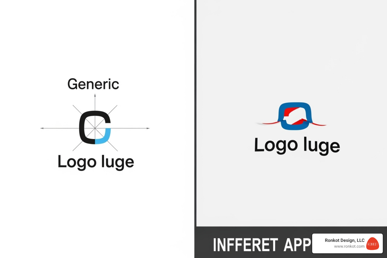
Your primary logo is your main ambassador – the version you’ll use most often. But you’ll also need secondary variations for different situations. Maybe you need a horizontal version for website headers and a stacked version for business cards. Some brands even create icon-only versions for social media profiles or app icons.
Clear space rules are crucial but often overlooked. Your logo needs room to breathe, just like people do in crowded spaces. Defining this protective zone prevents other elements from crowding your logo and diluting its impact. Most successful brands base this clear space on a proportion of the logo itself – often the height of a key element within the design.
Setting a minimum size ensures your logo remains legible whether it’s on a massive billboard or a tiny social media avatar. And here’s where the “don’ts” become just as important as the “do’s” – showing examples of stretched, skewed, or recolored logos helps everyone understand what damages your brand’s professional appearance.
Defining the Color Palette
Color speaks before words do. It triggers emotions, creates instant recognition, and can make or break someone’s first impression of your brand. That’s why precise color documentation isn’t just helpful – it’s essential.
Your primary colors do the heavy lifting in your brand identity. These are the colors people will associate most strongly with your business. Secondary colors provide flexibility and depth, while accent colors add personality and help important elements stand out.
But here’s where many businesses stumble – they choose great colors but don’t document them properly. Each color needs specific codes for different applications. HEX codes ensure your website colors look exactly right, while RGB values handle other digital applications. For printed materials, CMYK codes prevent that disappointing moment when your beautiful brand purple prints as muddy brown.
Pantone colors become important when exact color matching is critical – think business cards, branded merchandise, or signage. Online color palette tools can help you explore and document your palette, but the real magic happens when you give your colors memorable names that reflect your brand’s personality.
Specifying Typography
Typography is your brand’s voice made visible. The fonts you choose communicate personality before anyone reads a single word. A playful script font tells a completely different story than a clean, modern sans-serif.
Font hierarchy creates order and guides your reader’s eye through your content. Your display fonts grab attention, your header fonts organize information, and your body text fonts ensure comfortable reading. Think of it like a well-orchestrated conversation – each type style plays its role.
Specifying font families means choosing your primary workhorses and secondary supporting players. Your primary fonts handle most situations, while secondary fonts add variety or solve specific problems. Document which weights and styles you’ll use – maybe regular and bold for headers, but only regular for body text.
Sizing and spacing guidelines prevent the common problem of inconsistent text formatting across different materials. When everyone knows the exact font sizes, line heights, and spacing rules, your brand maintains its polished appearance whether someone’s reading your website or your business cards.
Don’t forget about web fonts – ensuring your chosen typography displays correctly across all digital platforms protects your brand’s consistency in our increasingly digital world. This attention to typographic detail directly impacts user experience, which we explore further in our guide on Elements of a Winning Website Design.
Photography and Iconography
Images speak louder than words, and your photography style needs to align perfectly with your brand personality. Are your photos warm and candid, or clean and minimalist? Do you focus on real people in authentic situations, or do you prefer product-focused shots with dramatic lighting?
Image style guidelines should cover subject matter, mood, and treatment. Maybe your brand calls for natural lighting and genuine smiles, or perhaps you need crisp, professional shots with consistent backgrounds. The key is ensuring every photo feels like it belongs in your brand family.
Custom icons deserve the same attention as your logo. They should share visual DNA with your other brand elements – similar line weights, corner styles, and overall aesthetic. Well-designed icons don’t just look pretty; they help users steer and understand your content more easily.
This visual consistency becomes especially important for digital experiences, where images and icons work together to create seamless user journeys. We dive deeper into this topic in our article about Types of Visuals to Include in Blog for Better UX and Rankings.
Establishing Brand Voice and Tone
While not strictly visual, your brand voice is the personality that comes through in every word you write. It’s the difference between sounding like a stuffy corporation or a trusted friend. Your voice stays consistent, but your tone adapts to the situation – just like how you might speak differently at a business meeting versus a casual coffee chat.
Personality traits should reflect your brand strategy. Are you confident but not arrogant? Professional yet approachable? Knowledgeable without being condescending? These characteristics guide every piece of content you create.
Vocabulary choices matter more than you might think. The words you use – and avoid – shape how people perceive your brand. Maybe you always say “help” instead of “assist,” or perhaps you avoid industry jargon that confuses your customers.
Grammar and style preferences keep your communications consistent. Do you use contractions to sound more conversational? Do you write in active voice to sound more direct? These seemingly small choices add up to create a distinctive brand voice.
Most importantly, provide real examples of your voice in action. Show how you’d handle a customer service email, write a social media post, or craft website copy. These concrete examples help everyone understand not just what to say, but how to say it in your brand’s unique voice.
Application and Best Practices for a Living Brand
Creating visual identity guidelines is just the beginning of your brand journey. The real magic happens when these guidelines come alive through consistent application across every touchpoint where your customers encounter your brand.
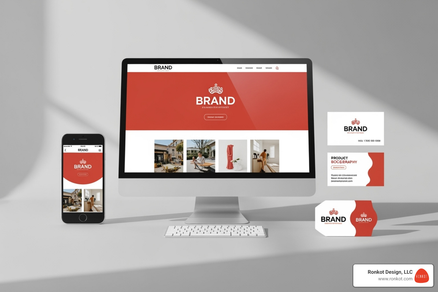
Think of your brand guidelines as a living document that grows and adapts with your business. Just like a favorite recipe that gets tweaked and perfected over time, your visual identity guidelines should evolve to stay fresh and relevant while maintaining their core essence.
Applying Your visual identity guidelines Consistently
The true test of effective brand guidelines isn’t how beautiful they look in a PDF—it’s how well they translate into real-world applications that your customers actually see and interact with.
Digital platforms are often where your brand makes its first impression. Your website needs to seamlessly reflect your brand identity, from the carefully chosen color palette to the typography that guides readers through your content. Email campaigns should feel like natural extensions of your brand, while mobile apps must adapt your visual identity to smaller screens without losing impact. At Ronkot Design, we see this integration as crucial when Designing the Perfect Website for Your Business, ensuring every digital touchpoint reinforces your brand story.
Print materials require a different approach but equal attention to detail. Business cards become miniature brand ambassadors, while brochures and packaging need to translate your digital color palette into precise CMYK and Pantone specifications. The challenge here is maintaining color accuracy—what looks perfect on your computer screen needs to print beautifully on paper too.
Social media platforms each have their own personality and technical requirements. Your brand needs to feel authentic on Instagram’s visual-first platform while adapting to LinkedIn’s professional atmosphere. The key is flexibility within consistency—your brand should be recognizable whether someone encounters it on a Facebook ad or a Twitter post.
Internal communications often get overlooked, but they’re equally important. When your team uses branded presentation templates and email signatures, it reinforces your brand culture from the inside out. Even employee apparel becomes part of your brand story, creating walking ambassadors for your business.
Best Practices for Creating and Using Your Guide
The most comprehensive brand guidelines in the world won’t help if nobody can find them or understand how to use them. Successful brand management is about making consistency easy and accessible for everyone involved.
Making your guidelines accessible should be your top priority. Store them where your team can easily find them—whether that’s a shared drive, an internal website, or a cloud-based platform. The B.C. Visual Identity Program demonstrates this well by specifying their BC Sans typeface for all government digital services, making it crystal clear what everyone should use.
Keeping guidelines updated is where many brands stumble. Your business evolves, launches new products, enters new markets, and adapts to changing customer needs. Your brand guidelines should reflect these changes. Schedule annual reviews to assess what’s working and what needs refreshing. Version your guidelines clearly so everyone knows they’re working with the most current information.
Providing templates and tools transforms your guidelines from a reference document into a practical toolkit. Pre-built presentation templates, social media graphics, and email signatures make it effortless for your team to stay on-brand. When consistency becomes the easy choice rather than extra work, compliance naturally improves.
Showing real examples makes abstract concepts concrete. Include plenty of visual demonstrations of correct usage alongside clear examples of what not to do. This visual approach helps prevent well-intentioned mistakes that can dilute your brand impact.
Learning from successful brands can provide valuable inspiration. Reviewing style guides from other companies can showcase different approaches to brand guidelines. Study guides that are known for their clarity and practical application—you’ll often find that the most effective guides prioritize usability over complexity.
The goal isn’t perfection from day one—it’s creating a system that grows stronger and more refined with each application. Your visual identity guidelines should empower creativity within clear boundaries, giving your team the confidence to make brand-aligned decisions even when you’re not looking over their shoulder.
Frequently Asked Questions about Visual Identity Guidelines
Throughout our years of helping businesses develop their brand identities, we’ve noticed the same questions come up time and again. Let me share the answers to the most common ones we hear.
What is the difference between a brand guide and a style guide?
This is probably the question we get asked most often, and honestly, it’s no wonder people are confused. These terms get tossed around interchangeably, but there’s actually a meaningful difference in what they cover.
A brand guide is like your brand’s autobiography. It’s the comprehensive document that tells the whole story of who you are as a company. This includes your mission statement, core values, brand personality, and target audience. It explains why your brand exists and what makes it tick. Think of it as the strategic foundation that guides every decision you make.
A style guide, on the other hand, is more like your brand’s wardrobe manual. It focuses specifically on the visual design elements—how your logo should be used, what your color palette looks like, which fonts to use, and how your imagery should feel. It’s the tactical part that ensures everything looks consistent.
When we create visual identity guidelines for our clients, we typically combine both approaches. After all, you can’t make good visual decisions without understanding the strategy behind them. It’s like trying to dress for an occasion without knowing whether you’re going to a beach party or a board meeting.
How often should brand guidelines be updated?
Your visual identity guidelines aren’t meant to be carved in stone and forgotten about. They’re living, breathing documents that should grow with your business.
We recommend giving your guidelines a thorough review at least once a year. Think of it like an annual checkup for your brand’s health. During this review, ask yourself: Are these guidelines still serving us well? Have we launched new products or services that need to be addressed? Are we using new marketing channels that require specific rules?
Sometimes, bigger changes call for more immediate updates. If you’re going through a rebrand, expanding into new markets, or shifting your target audience, your guidelines will need to reflect those changes. We’ve seen businesses try to stretch outdated guidelines to cover new situations, and it rarely ends well.
The key is being proactive rather than reactive. It’s much easier to update your guidelines gradually than to realize six months later that nobody knows how to handle your brand’s presence on the latest social media platform.
Can a small business create a simple one-page style guide?
Absolutely! In fact, we often encourage our smaller clients to start with exactly this approach. You don’t need a 50-page document to maintain brand consistency—you just need to cover the essentials that matter most to your day-to-day operations.
A well-designed one-page guide can be incredibly powerful. Focus on including your primary logo with basic usage rules, your core color palette with the essential codes (HEX for web, at minimum), your main fonts for headings and body text, and a brief description of your brand voice.
This approach is not only budget-friendly but also much more likely to actually get used. We’ve seen elaborate brand guides that look impressive but end up gathering digital dust because they’re too overwhelming for busy team members to reference quickly.
The beauty of starting simple is that you can always expand later. As your business grows and your branding needs become more complex, you can build on that solid one-page foundation. It’s like starting with a studio apartment and eventually moving to a house—you begin with what you need and grow from there.
Conclusion
Creating comprehensive visual identity guidelines isn’t just about making your brand look pretty—it’s about building a foundation that transforms casual viewers into loyal customers. When every touchpoint speaks with the same visual voice, something powerful happens: your brand becomes instantly recognizable, trusted, and memorable.
Think about the brands you trust most. They all share one thing in common: consistency. Whether you see their logo on a billboard, their website on your phone, or their social media post in your feed, you immediately know who they are. That’s the magic of well-executed visual identity guidelines at work.
Your guidelines become the silent guardians of your brand’s reputation. They ensure that whether your team is designing a new webpage, your social media manager is creating a post, or an external partner is developing marketing materials, every piece contributes to a cohesive brand story that builds equity over time.
The investment in creating these guidelines pays dividends in ways you might not expect. Your team spends less time second-guessing design decisions. External partners can work more efficiently with clear direction. Most importantly, your customers develop that crucial sense of familiarity and trust that turns them into brand advocates.
At Ronkot Design, we’ve seen how the right visual identity guidelines can transform a business from forgettable to unforgettable. Our data-driven, customer-centric approach means we don’t just create guidelines that look good—we create frameworks that drive real growth and recognition.
Your brand deserves to be more than just another logo in the crowd. It deserves to be recognized, trusted, and remembered. Strong visual identity guidelines are your roadmap to making that happen, ensuring every interaction with your brand moves you closer to your business goals.
Ready to build a brand presence that stands out and stands the test of time? Find how our expertise can lift your brand through our Corporate Identity & Graphic Design Services.
Ronak Kothari is the founder of RONKOT, a full-service digital marketing agency.